|
Skin Package Documentation.
Updated: December 3, 2000 8:23PM Revision history: December 3, 2000 8:23PM - Added 3 colors to layout.pcx for 3 new controls (add player, remove player, and send message). Updated preview.pcx description to specify masking color. |
|
Skin Packages are a collection of files which change the appearance of Qtracker's PlayerWatch window.
File Format The package itself is nothing more than a Zip archive with a different file extension. You can use programs such as WinZip to create a Zip archive. File Extension Packages must have an extension of ".qtsk". For example, if your Zip archive was "MySkin.zip", you would rename your Zip archive to "MySkin.qtsk". The icon of the file will then change to a Qtracker icon. Required Files Several files are required to be in your Skin Package. These files define the contents of your package, author information, layouts, options, and skin images. author.txt bg.pcx down-button.pcx info.pcx layout.pcx minimize-button.pcx more-down.pcx more-up.pcx preview.pcx style.txt up-button.pcx |
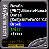
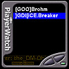 Sample Skin |
| File: author.txt | ||
|
This is a text file which is used to name your skin, provide author and contact information, and any comments you may wish to include.
This information will be displayed when installing your skin, and when browsing or changing skins from within Qtracker.
Each line defines a variable. The format of each line is <variable name> space <variable value> The only variables supported at this time are:
A sample file would look like: description Hi-Fi PlayerWatch skin filename Hi-Fi.qtsk author Ronald E. Mercer email rmercer@qtracker.com notes Hi-Fi PlayerWatch skin. url http://www.qtracker.com |
| File: bg.pcx | |
This is the primary (background) image used by your skin.
All other controls, player information, marquees, etc will be overlayed on top of this image.
It can be any size, shape, or color depth, but keep in mind the PlayerWatch window was intended to be small and compact.
 Color RGB(127,0,0)
is reserved for the mask/transparency.
Color RGB(127,0,0)
is reserved for the mask/transparency.
|
 bg.pcx |
| File: down-button.pcx | |
|
This state image contains the down scroll button for advancing to the next player in the PlayerWatch listing.
It contains both states, from left to right: pressed and depressed.
The width, mask/transparency, and position of the button is determined by layout.pcx . Since this image contains both the pressed and depressed images, multiply the button width by 2 to determine what your actual image width will be. For example, if your button is 100 pixels wide then down-button.pcx would be 200 pixels wide. The left half of the image (pixels 0-99 horizontal from the left) would be the pressed button image, while the right half of the image (pixels 100-199 horizontal from the left) would be the depressed button image. There are no reserved colors for mask/transparency in this image. Masking/transparency for all controls is determined by layout.pcx . In the sample image provided, you'll notice I still use the standard mask/transparency color
RGB(127,0,0).
This is merely to make it easier to work on the image.
|
 down-button.pcx |
| File: info.pcx | |
|
This is the background image for the scrolling information marquee.
Server and player information will be overlayed onto this image and will scroll to the left.
The font, color, size, scroll speed, etc of the text is determined by style.txt . There are no reserved colors for mask/transparency in this image. Masking/transparency for all controls is determined by layout.pcx . In the sample image provided, you'll notice I still use the standard mask/transparency color
RGB(127,0,0).
This is merely to make it easier to work on the image.
|
 info.pcx |
| File: layout.pcx | |
|
This is probably the most important image in your skin, and no one will ever see it (unless the open up the skin package).
This image is responsible for defining the size, shape (mask/transparency), and position of all the controls.
You should notice that the sample image is full of bright colors. Each color represents a control and is used to generate a mask/transparency for each control. This image must be the same size as bg.pcx since it represents exactly where each control will be drawn over the background image.  RGB(255,192,0)
represents the marquee where server and player information scrolls.
RGB(255,192,0)
represents the marquee where server and player information scrolls.
 RGB(0,255,255)
represents the player listing which displays found players.
RGB(0,255,255)
represents the player listing which displays found players.
 RGB(0,255,0)
represents the status indicator which activates if more players are visible by scrolling down.
RGB(0,255,0)
represents the status indicator which activates if more players are visible by scrolling down.
 RGB(255,255,0)
represents the status indicator which activates if more players are visible by scrolling up.
RGB(255,255,0)
represents the status indicator which activates if more players are visible by scrolling up.
 RGB(0,0,255)
represents the scroll down button which move the current player selection down.
RGB(0,0,255)
represents the scroll down button which move the current player selection down.
 RGB(255,0,255)
represents the scroll up button which moves the current player selection up.
RGB(255,0,255)
represents the scroll up button which moves the current player selection up.
 RGB(255,0,0)
represents the minimize button which hides or minimizes the PlayerWatch window.
RGB(255,0,0)
represents the minimize button which hides or minimizes the PlayerWatch window.
 RGB(192,255,0)
represents the add button which allows a new player search string to be created.
RGB(192,255,0)
represents the add button which allows a new player search string to be created.
 RGB(0,255,192)
represents the remove button which removes the currently selected player and its associated search string.
RGB(0,255,192)
represents the remove button which removes the currently selected player and its associated search string.
 RGB(192,0,255)
represents the message button which sends a message to the selected player.
RGB(192,0,255)
represents the message button which sends a message to the selected player.
In the sample image provided, you'll notice I've included the background image. This is merely to make it easier to work on the image, as only the reserved colors listed above are used from this image. |
 layout.pcx |
| File: minimize-button.pcx | |
|
This state image contains the minimize button for minimizing or hiding the PlayerWatch window.
It contains both states, from left to right: pressed and depressed.
The width, mask/transparency, and position of the button is determined by layout.pcx . Since this image contains both the pressed and depressed images, multiply the button width by 2 to determine what your actual image width will be. For example, if your button is 15 pixels wide then minimize-button.pcx would be 30 pixels wide. The left half of the image (pixels 0-14 horizontal from the left) would be the pressed button image, while the right half of the image (pixels 15-29 horizontal from the left) would be the depressed button image. There are no reserved colors for mask/transparency in this image. Masking/transparency for all controls is determined by layout.pcx . In the sample image provided, you'll notice I still use the standard mask/transparency color
RGB(127,0,0).
This is merely to make it easier to work on the image.
|
 minimize-button.pcx |
| File: more-down.pcx | |
|
This state image contains a visual indicator that more players are visible by scrolling down (outside the viewing region).
It contains both states, from left to right: true and false.
The width, mask/transparency, and position of the indicator is determined by layout.pcx . Since this image contains both the true and false images, multiply the indicator width by 2 to determine what your actual image width will be. For example, if your indicator is 25 pixels wide then more-down.pcx would be 50 pixels wide. The left half of the image (pixels 0-24 horizontal from the left) would be the true image, while the right half of the image (pixels 25-49 horizontal from the left) would be false image. There are no reserved colors for mask/transparency in this image. Masking/transparency for all controls is determined by layout.pcx . In the sample image provided, you'll notice I still use the standard mask/transparency color
RGB(127,0,0).
This is merely to make it easier to work on the image.
|
 more-down.pcx |
| File: more-up.pcx | |
|
This state image contains a visual indicator that more players are visible by scrolling up (outside the viewing region).
It contains both states, from left to right: true and false.
The width, mask/transparency, and position of the indicator is determined by layout.pcx . Since this image contains both the true and false images, multiply the indicator width by 2 to determine what your actual image width will be. For example, if your indicator is 25 pixels wide then more-up.pcx would be 50 pixels wide. The left half of the image (pixels 0-24 horizontal from the left) would be the true image, while the right half of the image (pixels 25-49 horizontal from the left) would be false image. There are no reserved colors for mask/transparency in this image. Masking/transparency for all controls is determined by layout.pcx . In the sample image provided, you'll notice I still use the standard mask/transparency color
RGB(127,0,0).
This is merely to make it easier to work on the image.
|
 more-up.pcx |
| File: preview.pcx | |
|
This is a thumbnail image of your skin in action.
This preview image will be displayed when browsing skins within Qtracker.
Color RGB(127,0,0)
is reserved for the mask/transparency.
|
 preview.pcx |
| File: style.txt | ||
|
This is a text file which is used to control the appearance of the scrolling server/player information marquee.
Each line defines a variable. The format of each line is <variable name>=<variable value>. The only variables supported at this time are:
A sample file would look like: marquee_font_height=20 marquee_font_color=219,170,4 marquee_font_italic=no marquee_font_bold=yes marquee_font_antialias=no marquee_font_face=arial marquee_speed=96 |
| File: up-button.pcx | |
|
This state image contains the up scroll button for advancing to the previous player in the PlayerWatch listing.
It contains both states, from left to right: pressed and depressed.
The width, mask/transparency, and position of the button is determined by layout.pcx . Since this image contains both the pressed and depressed images, multiply the button width by 2 to determine what your actual image width will be. For example, if your button is 100 pixels wide then up-button.pcx would be 200 pixels wide. The left half of the image (pixels 0-99 horizontal from the left) would be the pressed button image, while the right half of the image (pixels 100-199 horizontal from the left) would be the depressed button image. There are no reserved colors for mask/transparency in this image. Masking/transparency for all controls is determined by layout.pcx . In the sample image provided, you'll notice I still use the standard mask/transparency color
RGB(127,0,0).
This is merely to make it easier to work on the image.
|
 up-button.pcx |